يتم التشغيل بواسطة Blogger.

الخميس، 29 سبتمبر 2011

Android’s HTTP Clients

Jesse Wilson

[This post is by Jesse Wilson from the Dalvik team. —Tim Bray]


Most network-connected Android apps will use HTTP to send and receive data. Android includes two HTTP clients: HttpURLConnection and Apache HTTP Client. Both support HTTPS, streaming uploads and downloads, configurable timeouts, IPv6 and connection pooling.

Apache HTTP Client

DefaultHttpClient and its sibling AndroidHttpClient are extensible HTTP clients suitable for web browsers. They have large and flexible APIs. Their implementation is stable and they have few bugs.

But the large size of this API makes it difficult for us to improve it without breaking compatibility. The Android team is not actively working on Apache HTTP Client.

HttpURLConnection

HttpURLConnection is a general-purpose, lightweight HTTP client suitable for most applications. This class has humble beginnings, but its focused API has made it easy for us to improve steadily.

Prior to Froyo, HttpURLConnection had some frustrating bugs. In particular, calling close() on a readable InputStream could poison the connection pool. Work around this by disabling connection pooling:

private void disableConnectionReuseIfNecessary() {
// HTTP connection reuse which was buggy pre-froyo
if (Integer.parseInt(Build.VERSION.SDK) < Build.VERSION_CODES.FROYO) {
System.setProperty("http.keepAlive", "false");
}
}

In Gingerbread, we added transparent response compression. HttpURLConnection will automatically add this header to outgoing requests, and handle the corresponding response:

Accept-Encoding: gzip

Take advantage of this by configuring your Web server to compress responses for clients that can support it. If response compression is problematic, the class documentation shows how to disable it.

Since HTTP’s Content-Length header returns the compressed size, it is an error to use getContentLength() to size buffers for the uncompressed data. Instead, read bytes from the response until InputStream.read() returns -1.

We also made several improvements to HTTPS in Gingerbread. HttpsURLConnection attempts to connect with Server Name Indication (SNI) which allows multiple HTTPS hosts to share an IP address. It also enables compression and session tickets. Should the connection fail, it is automatically retried without these features. This makes HttpsURLConnection efficient when connecting to up-to-date servers, without breaking compatibility with older ones.

In Ice Cream Sandwich, we are adding a response cache. With the cache installed, HTTP requests will be satisfied in one of three ways:

  • Fully cached responses are served directly from local storage. Because no network connection needs to be made such responses are available immediately.


  • Conditionally cached responses must have their freshness validated by the webserver. The client sends a request like “Give me /foo.png if it changed since yesterday” and the server replies with either the updated content or a 304 Not Modified status. If the content is unchanged it will not be downloaded!


  • Uncached responses are served from the web. These responses will get stored in the response cache for later.


Use reflection to enable HTTP response caching on devices that support it. This sample code will turn on the response cache on Ice Cream Sandwich without affecting earlier releases:

private void enableHttpResponseCache() {
try {
long httpCacheSize = 10 * 1024 * 1024; // 10 MiB
File httpCacheDir = new File(getCacheDir(), "http");
Class.forName("android.net.http.HttpResponseCache")
.getMethod("install", File.class, long.class)
.invoke(null, httpCacheDir, httpCacheSize);
} catch (Exception httpResponseCacheNotAvailable) {
}
}

You should also configure your Web server to set cache headers on its HTTP responses.

Which client is best?

Apache HTTP client has fewer bugs on Eclair and Froyo. It is the best choice for these releases.

For Gingerbread and better, HttpURLConnection is the best choice. Its simple API and small size makes it great fit for Android. Transparent compression and response caching reduce network use, improve speed and save battery. New applications should use HttpURLConnection; it is where we will be spending our energy going forward.

الأربعاء، 21 سبتمبر 2011

Euro Android Developer Labs

This series started last month, and now registration is open for the European leg:

  • Berlin — September 28 and 29.

  • London — October 3 and 5.

  • Paris — October 27 and 28.

Remember, this ADL series isn’t another set of introduction-to-Android sessions, nor any other kind of general overview. It's specifically aimed at optimizing Android apps for tablets, in particular creating high-quality tablet apps with an emphasis on polish and user-experience.

Registration is a two-step process. Anyone can register, but we can only accommodate a relatively small number of attendees from among the registrants, based on whether they already have an Android app with the potential to be a top-tier tablet app in terms of quality, fit, and finish. The goal is to bring your app to the ADL, and leave equipped to make it into one that makes Android tablet users smile.

الاثنين، 19 سبتمبر 2011

Preparing for Handsets

[This post is by Scott Main, lead tech writer for developer.android.com. — Tim Bray]

Early this year, Honeycomb (Android 3.0) launched for tablets. Although Honeycomb remains tablets-only, the upcoming Ice Cream Sandwich (ICS) release will support big screens, small screens, and everything in between. This is the way Android will stay from now on: the same version runs on all screen sizes.

Some Honeycomb apps assume that they’ll run only on a large screen, and have baked that into their designs. This assumption is currently true, but will become false with the arrival of ICS, because Android apps are forward-compatible — an app developed for Honeycomb is compatible with a device running ICS, which could be a tablet, a phone, or something else.


If you’ve developed a tablet app on Honeycomb, it’s important that your app do one of two things: prevent installation on smaller screens or (preferably) support smaller screens with the same APK.

Making your Honeycomb app for tablets only

If you don’t want your app to be used on handsets (perhaps it truly makes sense only on a large screen) or you need more time to update it, add the following declaration to your manifest:


android:normalScreens="false"
android:largeScreens="false"
android:xlargeScreens="true"
android:requiresSmallestWidthDp="600" />

...

This describes your app’s screen-size support in two different ways:

  • It declares that the app does not support the screen size buckets “small”, “normal”, and “large”, which are traditionally not tablets


  • It declares that the app requires a screen size with a minimum usable area that is at least 600dp wide


The first technique is for devices that are running Android 3.1 or older, because those devices declare their size based on generalized screen size buckets. The requiresSmallestWidthDp attribute is for devices running Android 3.2 and newer, which added the capability for apps to specify their size requirements based on a minimum number of density-independent pixels. In this example, the app declares a minimum width requirement of 600dp, which generally implies a 7”-or-greater screen.

Your size choice might be different, of course, based on how well your design works on different screen sizes; for example, if your design works well only on screens that are 9” or larger, you might require a minimum width of 720dp.

The catch is that you must compile your application against Android 3.2 or higher in order to use the requiresSmallestWidthDp attribute. Older versions don’t understand this attribute and will raise a compile-time error. The safest thing to do is develop your app against the platform that matches the API level you’ve set for minSdkVersion. When you’re making final preparations to build your release candidate, change the build target to Android 3.2 and add the requiresSmallestWidthDp attribute. Android versions older than 3.2 simply ignore that XML attribute, so there’s no risk of a runtime failure.

For more information about why the “smallest width” screen size is important for supporting different screen sizes, read New Tools for Managing Screen Sizes (really; it’s got lots of things you need to know).

Making your Honeycomb app work on handsets

On the other hand, if you want to distribute your app to devices of all sizes, we recommend that you update your existing Honeycomb app to work on smaller screens as well, rather than publishing multiple APKs.

Optimizing for handsets can be tricky if your designs currently use all of a large screen to deliver content. It’s worth the effort, though, because Ice Cream Sandwich brings the Honeycomb APIs to handsets and you’ll significantly increase the user-base for your app. Using a single APK for all devices also simplifies your updating and publishing process and makes it easier for users to identify your app.

Here are two guidelines to help make your Honeycomb tablet app work well on handsets:

  • Build your design around Fragments that you can reuse in different combinations, in single-pane layouts on handsets and multi-pane layouts on tablets


  • Be conservative with your Action Bar design so the system can adjust its layout based on the screen size


Creating single-pane and multi-pane layouts

The most effective way to optimize your app for both handsets and tablets is to combine fragments in different ways to create “single-pane” layouts for handsets and “multi-pane” layouts for tablets. There are two approaches to doing this:

  • For any screen in which your tablet version displays multiple fragments, use the same activity for handsets, but show only one fragment at a time — swapping the fragments within the activity when necessary.


  • Use separate activities to host each fragment on a handset. For example, when the tablet UI uses two fragments in an activity, use the same activity for handsets, but supply an alternative layout that includes just one fragment. When you need to switch fragments (such as when the user selects an item), start another activity that hosts the other fragment.


The approach you choose depends on your app design and personal preferences. The first option (single activity) requires that you dynamically add each fragment to the activity at runtime---rather than declare the fragments in your activity’s layout file — because you cannot remove a fragment from an activity if it’s been declared in the XML layout. You might also need to update the action bar each time the fragments change, depending on what actions or navigation modes are provided for the fragment. In some cases, these factors might not matter to your app, so using one activity and swapping fragments will work well. Other times, however, using just one activity and dynamically swapping fragments can make your code more complicated, because you must manage all the fragment combinations in the activity’s code rather than leveraging alternative layout files.

I’m going to talk about the second option in more detail. It might be a little more up-front work, because each fragment must work well across separate activities, but it usually pays off. It means that you can use alternative layout files that define different fragment combinations, keep fragment code modular, simplify action bar management, and let the system handle all the back stack work.

The following figure demonstrates how an application with two fragments can be arranged for both handsets and tablets when using separate activities for the handset design:

In this app, Activity A is the “main activity” and uses different layouts to display either one or two fragments at a time, depending on the size of the screen. When on a handset-sized screen, the layout contains only Fragment A (the list view); when on a tablet-sized screen, the layout contains both Fragment A and Fragment B.

Here’s res/layout/main.xml for handsets:


android:layout_width="match_parent"
android:layout_height="match_parent">
android:id="@+id/list_frag"
android:layout_width="match_parent"
android:layout_height="match_parent"/>

And res/layout-large/main.xml for tablets:


android:orientation="horizontal"
android:layout_width="match_parent"
android:layout_height="match_parent"
android:id="@+id/frags">
android:id="@+id/list_frag"
android:layout_width="@dimen/titles_size"
android:layout_height="match_parent"/>
android:id="@+id/details_frag"
android:layout_width="match_parent"
android:layout_height="match_parent" />

How the application responds when a user selects an item from the list depends on whether Fragment B is available in the layout. If Fragment B is there, Activity A notifies Fragment B to update itself. If Fragment B is not in the layout, Activity A starts Activity B (which hosts Fragment B).

To implement this pattern for your application, it's important that you develop your fragments to be highly compartmentalized. Specifically, you should follow two general guidelines:

  • Do not manipulate one fragment directly from another.


  • Keep all code that concerns content in a fragment inside that fragment, rather than putting it in the host activity’s code.


To avoid directly calling one fragment from another, declare a callback interface in each fragment class that it can use to deliver events to its host activity, which implements the callback interface. When the activity receives a callback due to an event (such as the user selecting a list item), it acts appropriately based on the current fragment configuration.

For example, Activity A from above handles item selections like this:

/** This is a callback that the list fragment (Fragment A) calls
when a list item is selected */
public void onItemSelected(int position) {
DisplayFragment fragB = (DisplayFragment) getFragmentManager()
.findFragmentById(R.id.display_frag);
if (fragB == null) {
// DisplayFragment (Fragment B) is not in the layout,
// start DisplayActivity (Activity B)
// and pass it the info about the selected item
Intent intent = new Intent(this, DisplayActivity.class);
intent.putExtra("position", position);
startActivity(intent);
} else {
// DisplayFragment (Fragment B) is in the layout, tell it to update
fragB.updateContent(position);
}
}

When DisplayActivity (Activity B) starts, it reads the data delivered by the Intent and passes it to the DisplayFragment (Fragment B).

If Fragment B needs to deliver a result back to Fragment A, then the process works similarly with a callback interface between Fragment B and Activity B. That is, Activity B implements a callback interface defined by Fragment B. When Activity B gets the callback, it sets the result for the activity and finishes itself. Activity A then receives the result and delivers it to Fragment A.

For a complete demonstration of this technique for creating different fragment combinations for different tablets and handsets, look at the code for this updated version of the Honeycomb Gallery sample.

Making the Action Bar work on handsets

As long as you’ve been using the framework’s implementation of ActionBar for your tablet app (rather than building your own), the conversion from tablets to handsets should be painless. The Android system will do the work for you; all you need to do is ensure that your action bar design is flexible. Here are some important tips:

  • When setting a menu item to be an action item, avoid using the “always” value. Use “ifRoom” for action items you’d like to add to the action bar. Now, you might need “always” when an action view does not have an alternative action for the overflow menu or when a menu item added by a fragment is low in the menu order and it must jump into the action bar at all times. But you should not use “always” more than once or twice.


  • When possible, provide icons for all action items and declare showAsAction="ifRoom|withText". This way, if there’s not enough room for the text, but there is enough for the icon, then just the icon may be used.


  • Avoid using custom navigation modes in the action bar. Use the built-in tab and drop-down navigation modes — they’re designed to be flexible and adapt to different screen sizes. For example, when the width is too narrow for both tabs and other action items, the tabs appear below the action bar. If your app requires a custom navigation mode in the action bar, thoroughly test it on smaller screens when Ice Cream Sandwich becomes available and make any adjustments necessary for a narrow action bar.


For example, the mock ups below demonstrates how the system might adapt an app’s action bar based on the available screen space. On the handset, only two action items fit, so the remaining menu items appear in the traditional menu and the tabs appear in a separate row. On the tablet, more action items can fit in the action bar and so do the tabs.

Some other tips

  • When working with a ListView, consider how you might provide more or less information in each list item based on the available space. That is, you can create alternative layouts to be used by the items in your list adapter such that a large screen might display more detail for each item.


  • Create alternative resource files for values such as integers, dimensions, and even booleans. Using size qualifiers for these resources, you can easily apply different layout sizes, font sizes, or enable/disable features based on the current screen size.


Testing your handset support

At this point you might be wondering, “How do I test my layout for smaller screens without a handset that runs Honeycomb?” Well, until Ice Cream Sandwich is available for the SDK, you technically can’t. So don’t publish your changes until you’re able to test on a device or emulator running ICS.

However, you can begin some early testing of your alternative layouts with a little trick: instead of using the “large” configuration qualifier for the tablet layouts, use the “land” qualifier (that is, instead of res/layout-large/main.xml, use res/layout-land/main.xml). This way, a Honeycomb tablet (or emulator) in landscape orientation uses your tablet design and the same device in portrait orientation uses your handset design. Just be certain to switch back to using the size qualifiers once you’re able to test on ICS.

Conclusion

Ice Cream Sandwich is coming, and with it, handsets will be able to install apps built on Honeycomb. We haven’t released the ICS SDK just yet, but you can start preparing your Honeycomb apps by thinking about how they should work on smaller screens.

So if you have a Honeycomb tablet app out there (and by that, I mean an app with minSdkVersion="11" or higher), you should make sure it’s available only on large screen devices for now. We hope that you’ll then follow our advice here and optimize your tablet app to support smaller screens, using the same APK for both tablets and handsets.

If your app supports API levels lower than 11, then there’s probably nothing you need to do right now, because your app is already running on handset devices. When the ICS SDK does arrive, though, it’ll still be important that you verify your app’s performance on the new platform.

Stay tuned to the blog for more information about ICS as it nears release.

الثلاثاء، 13 سبتمبر 2011

Thinking Like a Web Designer

[This post is by Roman Nurik, who is passionate about icons, with input from me and a bunch of the Framework engineers. —Tim Bray]

The number of people working on mobile apps, and specifically Android, is growing fast. Since modern mobile software-development is a relatively new profession, the community is growing by sucking in experts from related domains, one being web design and development.

It turns out that familiarity with web UI development, particularly using modern HTML5 techniques, can be a great primer for Android UI development. The Android framework and SDK have many analogues to tools and techniques in the Web repertoire of HTML, CSS, and JavaScript.

In this blog post, we’ll walk through a few web development features and look for matches in the world of Android UI development.

Device resolutions and physical sizes

One of the most important aspects of both Android UI design and web design is support for multiple screen resolutions and physical sizes. Just as your web app needs to work on any physical display and inside any size browser window, your native app needs to run on a variety of form factors, ranging from 2.5” phones to 10” tablets to (possibly) 50” TVs.

Let’s look at some ways in which CSS and Android allow for flexible and adaptive layouts.

Providing custom layouts for different resolutions

CSS3 media queries allow developers to include additional stylesheets to target different viewport and screen configurations. For example, developers can provide additional style rules or override existing styles for mobile devices. Although the markup (layout hierarchy) remains the same, CSS3 has several sophisticated techniques for completely transforming the placement of elements with different stylesheets.

Android has long offered a similar mechanism in resource directory qualifiers. This extends to many different types of resources (layouts, images or ‘drawables’, styles, dimensions, etc). Thus you can customize the view hierarchy as well as styling depending on device form factor, A base set of layouts for handsets can be extended for tablets by placing additional layouts in res/layout-xlarge or res/layout-sw600dp (smallest width 600 density-independent pixels) directories. Note that the latter syntax requires Android 3.2 or later.

Below is a CSS3 example of how one could hide a ‘left pane’ on smaller devices and show it on screens at least 600 pixels wide:

#leftPane {
display: none;
}

@media screen and (min-device-width:600px) {
#leftPane {
display: block;
}
}

The same could be accomplished on Android using multiple layout directories:

res/layout/foo.xml:


res/layout-sw600dp/foo.xml:


As a side note, if you plan on creating multi-pane layouts, consider using fragments, which help break up your screens into modular chunks of both layout and code.

There are also other neat ways of using resource directory qualifiers. For example, you could create values/dimens.xml and values-sw600dp/dimens.xml files specifying different font sizes for body text, and reference those values in your layouts by setting android:textSize="@dimen/my_body_text_size". The same could be done for margins, line spacing, or other dimensions to help manage whitespace on larger devices.

‘Holy grail’ layouts

Web developers have long dreamt of an easy way to build a ‘holy grail’ 5-pane layout (header/footer + 3 vertical columns). There are a variety of pre-CSS3 tricks including position:fixed, float:left, negative margins, and so on, to build such layouts but CSS3 introduced the flexible box module, which simplifies this tremendously.

Figure: An archetypal “holy grail” layout

It turns out that grail is pretty holy for Android tablet apps, too, and in particular for tablets held sideways in landscape mode. A good approach involves the use of LinearLayout, one of the simplest and most popular of the Android layouts.

LinearLayout has this neat way to stretch its children to fit the remaining space, or to distribute available space to certain children, using the android:layout_weight attribute. If a LinearLayout has two children with a fixed size, and another child with a nonzero layout_weight, that other child view will stretch to fill the remaining available space. For more on layout_weight and other ways to make layouts more efficient (like switching from nested LinearLayouts to RelativeLayout), check out Layout Tricks: Creating Efficient Layouts.

Let’s take a look at some example code for implementing such a ‘holy grail’ layout on Android and on the web:

    android:id="@+id/container"
android:layout_width="match_parent"
android:layout_height="match_parent"
android:orientation="vertical">


android:layout_width="match_parent"
android:layout_height="50dp" />

android:layout_width="match_parent"
android:layout_height="0dp"
android:layout_weight="1"
android:orientation="horizontal">


android:layout_width="300dp"
android:layout_height="match_parent" />


android:layout_width="0dp"
android:layout_height="match_parent"
android:layout_weight="1" />


android:layout_width="300dp"
android:layout_height="match_parent" />


android:layout_width="match_parent"
android:layout_height="50dp" />

Note: Android tablet apps in landscape will generally show an action bar as the top pane and will usually have neither a right nor bottom pane. Also note that the action bar layout is automatically provided by the framework as of Android 3.0, and thus you don’t need to worry about positioning it.

And here’s an example implementation using the CSS3 flexible box model; notice the similarities:


Layered content

In CSS, with position:absolute, you can overlay your UI elements. On Android, you can use FrameLayout to achieve this. The child views in a frame layout are laid out on top of each other, with optional layout_gravity attributes indicating alignment with the parent frame layout.

Below is a contrived example of a FrameLayout with three children.

Figure: Example FrameLayout with three children (2 with top-left and 1 bottom-right alignment)

Figure: Isometric view of the example FrameLayout and its children.

The code for this example is as follows:

    android:layout_width="300dp"
android:layout_height="200dp">


android:layout_width="100dp"
android:layout_height="150dp" />


android:layout_width="200dp"
android:layout_height="175dp" />


android:layout_width="100dp"
android:layout_height="match_parent" />

Scrollable content

HTML, by default, flows in reading order and scrolls vertically. When content extends beyond the bottom of the browser, scrollbars automatically appear. Content panes can also be made individually scrollable using overflow:scroll or overflow:auto.

Android screen content isn’t scrollable by default. However, many content Views such as ListView and EditText offer scrolling, and any layout can be made scrollable by wrapping it in a ScrollView or HorizontalScrollView.

It’s also possible to add custom scrolling to views by using methods like View.scrollTo and helpers like Scroller in response to touch events. And for horizontal, snap-to-page-bounds scrolling, one can use the excellent new ViewPager class in the support library.

Below is an example of a ScrollView containing a single TextView child and the code needed to implement something like this.

Figure: A TextView inside a ScrollView, scrolled about half way.


android:layout_width="match_parent"
android:layout_height="match_parent">


android:layout_width="match_parent"
android:layout_height="wrap_content"
android:padding="32dp"
android:textSize="48sp"
android:text="The\nquick\nbrown\nfox\njumps\nover..." />

Custom layouts

Sometimes the positioning and layout behaviors you can achieve with CSS aren’t enough to achieve your desired layout. In those cases, developers fall back on JavaScript coupled with absolute positioning to place and size elements as needed.

Programmatically defined layouts are also possible on Android. In fact, they’re sometimes the most elegant and/or performant way of implementing a unique or otherwise tricky layout. Not happy with nesting LinearLayouts for implementing a 2x3 grid of navigation icons? Just extend ViewGroup and implement your own layout logic! (see an example DashboardLayout here). All the built-in layouts such as LinearLayout, FrameLayout, and RelativeLayout are implemented this way, so there generally aren’t the same performance implications with custom layouts as there are with scripted layout on the web.

Device densities

Web designers have long dealt with the reality that display densities vary, and that there wasn’t much they could do about it. This meant that for a long time web page graphics and UI elements had different physical sizes across different displays. Your 100px wide logo could be 1” wide on a desktop monitor or ¾” on a netbook. This was mostly OK, given that (a) pointing devices such as mice offered generally good precision in interacting with such elements and (b) browsers allowed visually-impaired users to zoom pages arbitrarily.

However, on touch-enabled mobile devices, designers really need to begin thinking about physical screen size, rather than resolution in pixels. A 100px wide button on a 120dpi (low density) device is ~0.9” wide while on a 320dpi (extra-high density) screen it’s only ~0.3” wide. You need to avoid the fat-finger problem, where a crowded space of small touch targets coupled with an imprecise pointing tool (your finger) leads to accidental touches. The Android framework tries really hard to take your layout and scale elements up or down as necessary to work around device-density differences and get a usable result on a wide range of them. This includes the browser, which scales a 160px at 100% browser zoom up to 240px on a 240dpi screen, such that its physical width is always 1”.

Developers can achieve finer-grained control over this browser scaling by providing custom stylesheets and images for different densities, using CSS3 media query filters such as -webkit-max-device-pixel-ratio and viewport arguments such as target-densitydpi=device-dpi. For an in-depth discussion on how to tame this mobile browser behavior see this blog post: Pixel-perfect Android web UIs.

For native Android apps, developers can use resource directory qualifiers to provide different images per density (such as drawable-hdpi and drawable-mdpi). In addition, Android offers a special dimension unit called ‘density independent pixels’ (dp) which can (and should!) be used in layout definitions to offset the density factors and create UI elements that have consistent physical sizes across screens with different densities.

Features you don’t have out of the box

There are a few features that web designers and developers rely on that aren’t currently available in the Android UI toolkit.

Developers can defer to user-driven browser zooming and two-dimensional panning for content that is too small or too large for its viewport, respectively. Android doesn’t currently provide an out-of-the-box mechanism for two-dimensional layout zooming and panning, but with some extra legwork using existing APIs, these interactions are possible. However, zooming and panning an entire UI is not a good experience on mobile, and is generally more appropriate for individual content views such as lists, photos, and maps.

Additionally, vector graphics (generally implemented with SVG) are gaining in popularity on the Web for a number of reasons: the need for resolution independence, accessibility and ‘indexability’ for text-heavy graphics, tooling for programmatic graphic generation, etc. Although you can’t currently drop an SVG into an Android app and have the framework render it for you, Android’s version of WebKit supports SVG as of Android 3.0. As an alternative, you can use the very robust Canvas drawing methods, similar to HTML5’s canvas APIs, to render vector graphics. There are also community projects such as svg-android that support rendering a subset of the SVG spec.

Conclusion

Web developers have a number of different tools for frontend layout and styling at their disposal, and there are analogues for almost all of these in the world of Android UI engineering. If you’re wondering about analogues to other web- or CSS-isms, start a conversation out there in the Android community; you’ll find you’re not alone.

الاثنين، 12 سبتمبر 2011

More Carrier Billing Options on Android Market


[This post is by Eric Chu, Android Developer Ecosystem. —Dirk Dougherty]


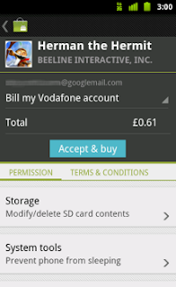
Over the past year, we’ve seen very strong growth in the number of Android users around the world. To make it easier for those users to purchase their favorite apps and games on Android Market, we’re bringing Direct Carrier Billing to additional carrier networks in South Korea, the UK, and Germany.


In South Korea, we’ve begun a phased rollout of the service to users on the top two carrier networks — SK Telecom and KT Corporation. When complete, the rollout will reach more than 10 million users, who will be able to charge their Android Market purchases straight to their phone bills.


In Europe, we’re rolling out the service to users on two popular regional carriers, Vodafone UK and Vodafone DE. Initially, the service will be available only to users who have purchased their devices through Vodafone’s online and retail channels.


The new launches expand the network of carriers already offering direct billing service in the US on the T-Mobile, AT&T, and Sprint networks, and in Japan on SoftBank, KDDI, and NTT DOCOMO networks.


Direct Carrier Billing is a key payment option for users worldwide, especially in regions where credit cards are less common. We will continue to partner with more operators to offer this payment option to their Android users. Watch for more announcements in the weeks ahead.
جميع الحقوق محفوظة لــ: RabbitsTeam 2016 © تصميم : كن مدون